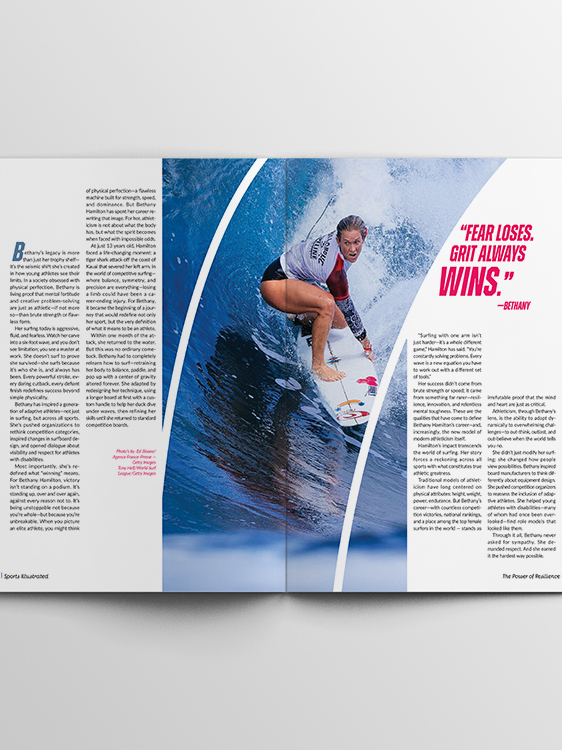
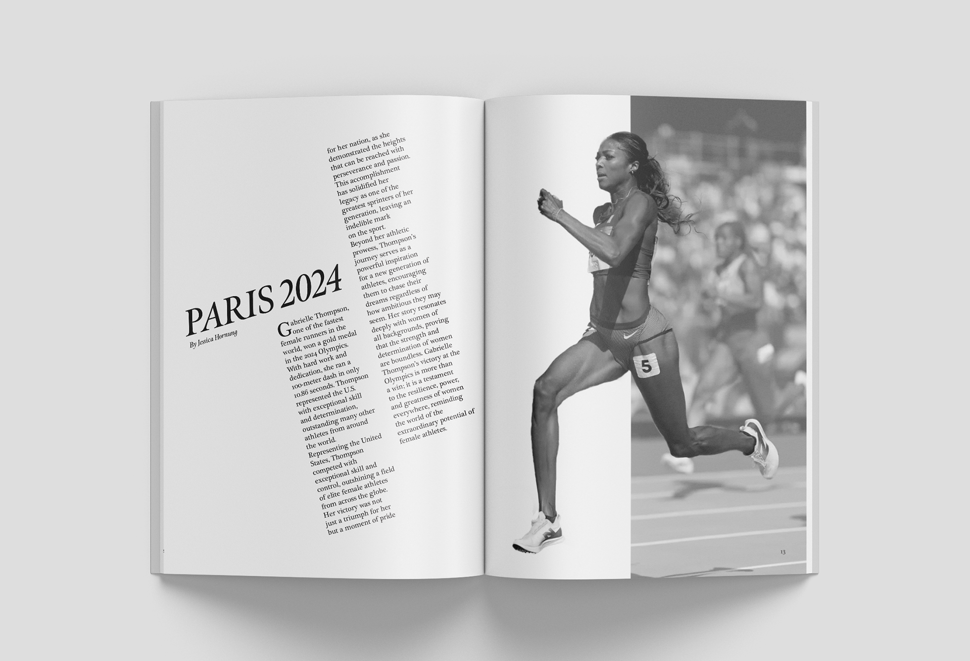
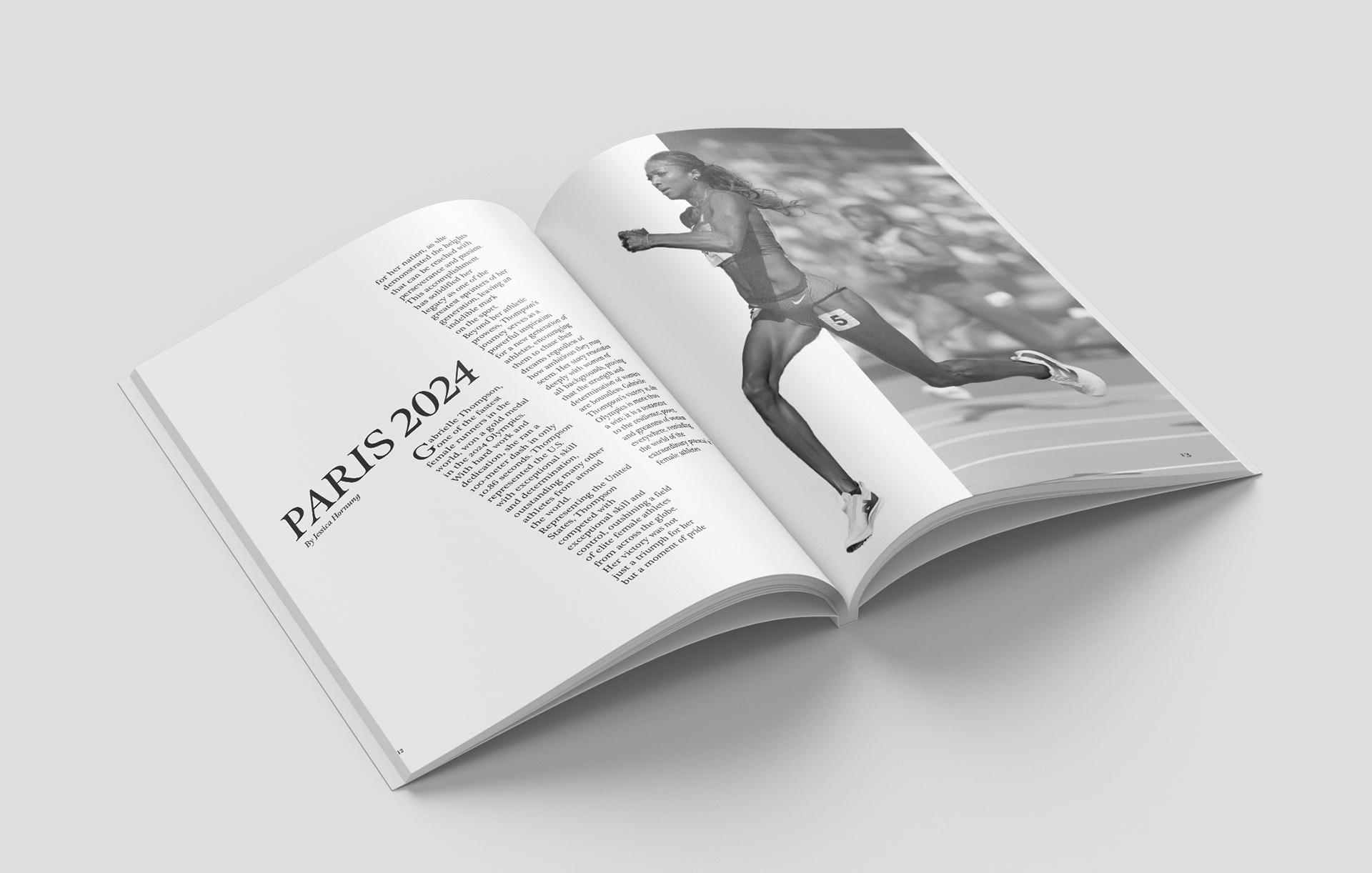
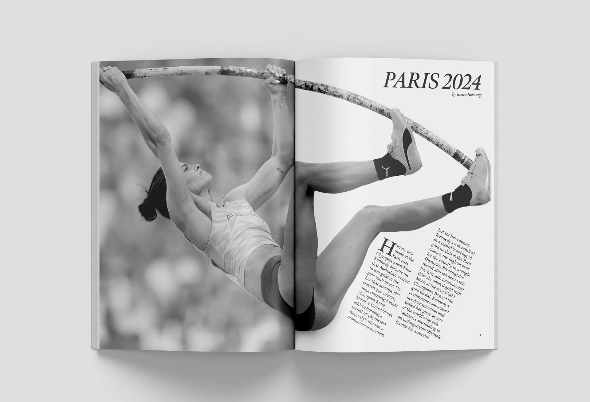
I chose to replicate Alexey Brodovitch’s iconic Harper’s Bazaar magazine spreads. During my research on Brodovitch, I discovered that his work often centered around women, particularly in themes of ballet, fashion, and advertising. Inspired by this, I decided to make women the focus of my appropriation as well.
While brainstorming, I connected my concept to the 2024 Olympics, which were hosted in Paris—the same city where Brodovitch worked on Harper’s Bazaar. This connection felt meaningful and added depth to my project. I also wanted to portray my subject as strong, independent, talented, and beautiful, echoing Brodovitch’s ability to portray elegance and dynamism.
For the design, I experimented with different type settings for the body and headline copy. Ultimately, I settled on a serif font for both, as it maintains a classy and professional look. I italicized the headline to emphasize movement and energy, a hint towards the athletic theme of the Olympics.
When it came to photography, I debated between a modern, colorful aesthetic and a classic black-and-white approach to align more closely with Brodovitch’s era. I ultimately chose black and white, as it evokes a nostalgic feel and ties seamlessly to the appropriation theme.
Role: Editorial Design, Layout, Art Direction
Tools: Adobe InDesign, Photoshop
Role: Editorial Design, Layout, Art Direction
Tools: Adobe InDesign, Photoshop